


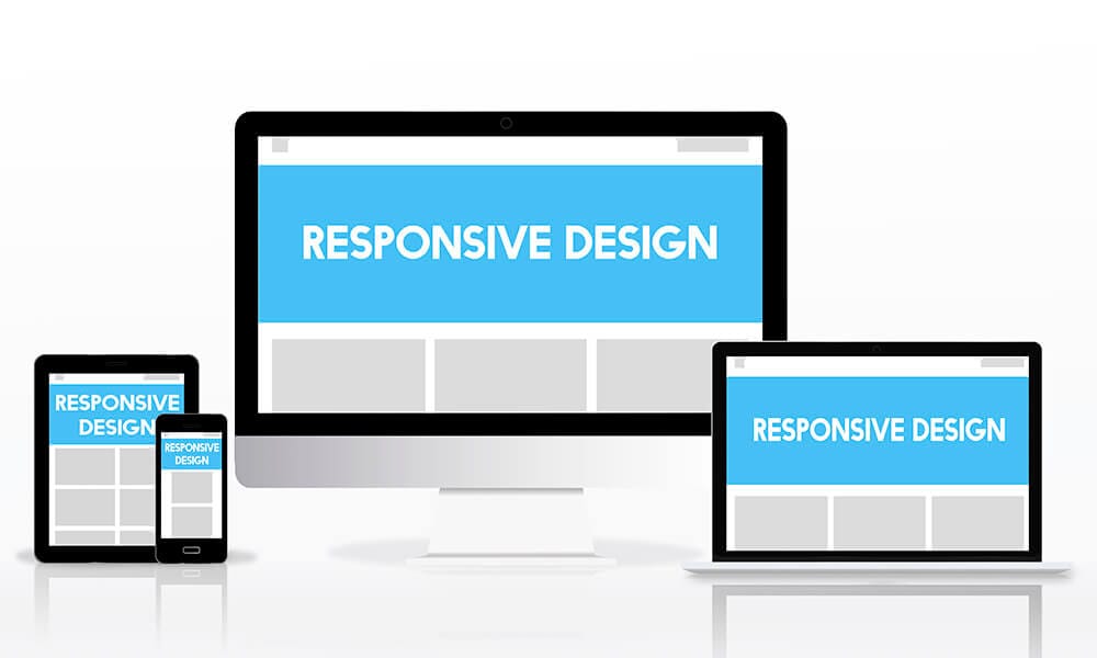
Responsive design helps websites remain usable, fast and consistent across phones, tablets and desktop screens.
Responsive web design allows a website to adapt to different screen sizes and input methods. It is not simply about shrinking a desktop layout; content priority, touch targets, navigation and performance must be reconsidered for smaller screens.
Core principles
- Use fluid grids and flexible media.
- Define breakpoints according to content rather than device brands.
- Keep buttons and form controls easy to use by touch.
- Serve appropriately sized images.
- Test long headings, menus, tables and validation messages.
Business impact
A mobile-friendly experience reduces friction for visitors arriving from search, social media and messaging applications. It also supports accessibility, conversion performance and search visibility.
UST Bilişim Approach
Let us turn insight into a practical project.
We will evaluate your requirement from technical, operational and commercial perspectives and define the right roadmap.
Tell Us About Your Project